
The Open Bottle
Refreshing a Chicagoland beer shop and taproom with an approachable and playful typographic aesthetic.
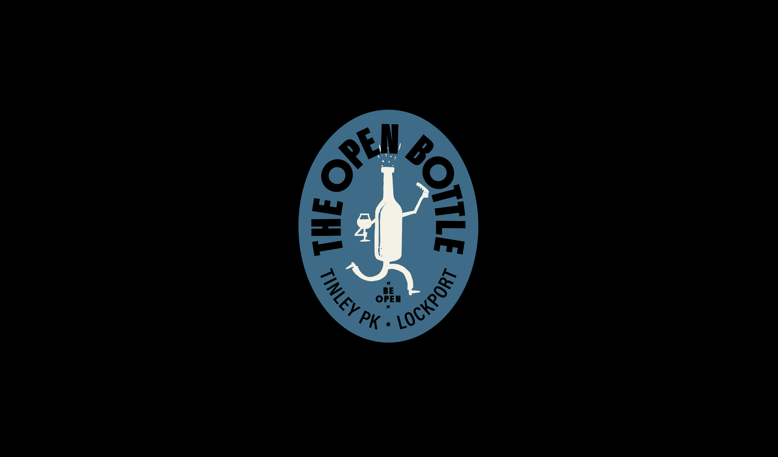
This Chicago beer shop and taproom needed a visual refresh that better exhibited its expertise and playful, approachable vibe. We leaned into The Open Bottle's name to drive the type-centric brand refresh. Circular graphics, text containers and circular text treatments and helped bring home this "open" aesthetic. Additionally, we chose to steer clear of any possible stuffiness, sometimes associated with bottle shops, and play up the whimsy by introducing a bottle mascot: "TOBY" entered the fold as a versatile character that could be adapted easily into different applications. Altogether, we executed this new look across signage, packaging, wearables and in-store touchpoints in time for their 10th anniversary.
↗ VISUAL IDENTITY ↗ ILLUSTRATION ↗ PRINT DESIGN ↗ PACKAGING ↗ SIGNAGE


Recognition
Society of Typographic Arts, STA 100, 2025
Communication Arts, Typography Annual, 2025
World Brand Design Society, Feature, 2025
Chicago Design Archive, Feature, 2025