
Studio Malt wins 2026 STA100 Best in Show
May 15, 2026
We are honored to share that five of our projects have been recognized as part of the STA 100 Awards held by the Society of Typographic Arts, including “Best in Show” recognition for our Clam Digger Ceasar Bar designs.
Each year the STA honors the 100 best examples of typographic excellence produced around the globe. Among the winners this year was our work for Palmer Brewing Company, Roaring Table, Meg & The Wheelers, and our Immigrants Make America Great! Artwork.
Established in 1927 in Chicago, the STA has been a vital participant in the Chicago design community, and the STA 100 competition has been 48 years in the making. Many thanks to this year’s judges—Lauren Hom, Lisa McCormick, Damian Orellana and Simon Walker—for considering our work.
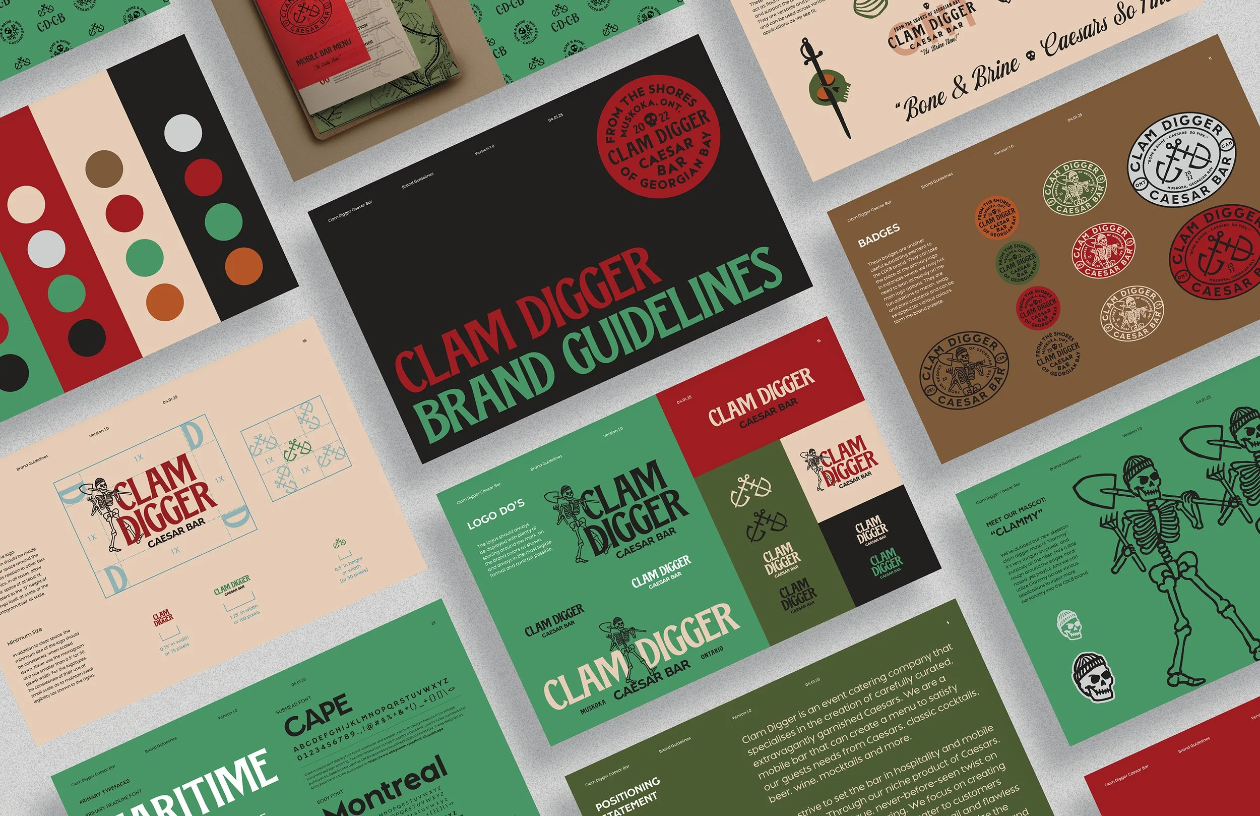
Clam Digger Caesar Bar
Ontario, Canada's Clam Digger Caesar Bar is a mobile beverage truck operated via a fleet of vintage Airstream trailers. As the company grew, they looked to elevate their brand with a fresh visual identity, highlighting their signature Caesar cocktails. We teamed up with them to rethink their aesthetic, with a playful personality chock-full of nautical type, and even a new mascot, "Clammy." The result was a striking and versatile new identity.

Palmer Brewing Co.
For the rollout of "Alaska's Heartland Brewery", Palmer Brewing Co., we had ample visuals to pull from. Nestled at the foot of the Chugach Mountains in the Matanuska Valley, the region has a rich farming past. It was from this that we built the identity for the new brand. We chose to pair a strong slab serif (Pitch) with several pieces of custom script, giving a nod to the area's agricultural history.
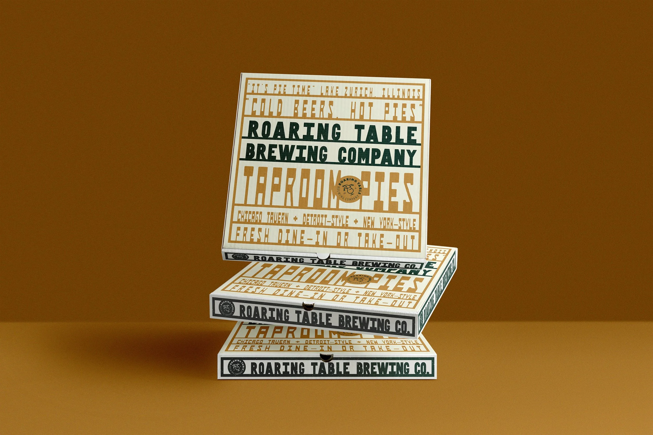
Roaring Table Brewing Co.
In conjunction with their 8th anniversary, Roaring Table Brewing Company launched in-house food offering for the first time in business. With their new kitchen, they chose to offer a variety of pizzas to pair with their taproom beer menu: Chicago-, Detroit–, and New York-style. After years of helping the brewery with their beer packaging design, we jumped at the chance to help create complimentary pizza packaging for their guest to dine-in or take-out.
The box designs lean into the type-centric approach we have leveraged for several of their beer labels in the past, giving nod to the owners' background as ad agency copywriters. The result was a playful and typographic design that felt quirky but welcoming, and was distinctly "RTBC".
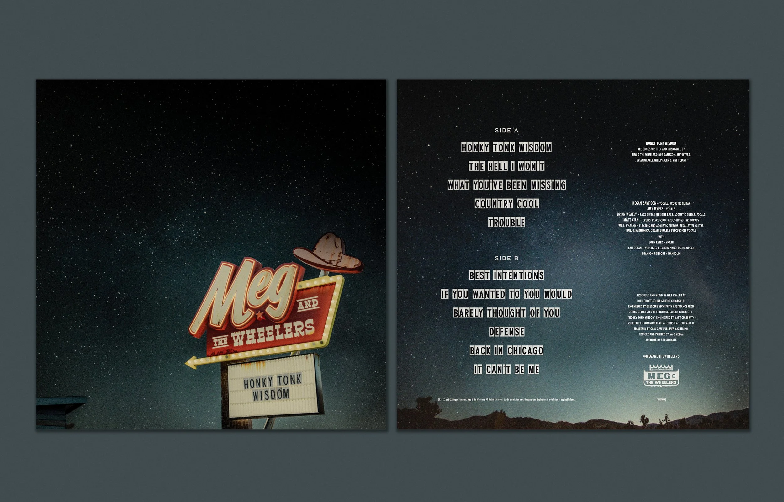
Meg & The Wheelers
With the launch of their debut album, "Honky Tonk Wisdom", Chicago country band Meg & the Wheelers reached out for help with the design of the LP. We worked together to create a concept that leaned into the band's "roadside" Western aesthetic. For the front of the album, we created an iconic-feeling, weathered neon sign, complete with a marquee to tease the album's name. On the LP's back side and vinyl labels, we continued the same signage aesthetic, with acrylic marquee type for the track titles and vital information.


Immigrants Make America Great!
Amidst a rise in harassment and intimidation of immigrants in the USA, we chose to create a powerful image accompanied by a succinct statement, reminding everyone of the original, welcoming message of this country. A sentiment that really needn’t be said–still, we wanted a way to bring the message to folks as a visual reminder.
Borrowing from powerful imagery and a poignant message, our poster aimed to remind people to stand strong and support their neighbors. With the poster's woodblock type framing the outstretched hand of Lady Liberty, it was a reminder to stand for freedom. We sold the 18x24 prints and gave the proceeds to The Illinois Coalition for Immigration & Refugee Rights, an organization that is doing their part to provide much needed assistance for those that need it most.
Migration is a human right, and we believe in decency, empathy and humanity for everyone.
–––